Making a Modern Map of the Valley
Once after presenting a program in which I used my own maps to illustrate troop movements, an attendee remarked how impressive it was that I hand drew all the mountains. I think he was disappointed upon learning clarification that the base layer was actually computer-generated from datasets. Nonetheless, creating usable shaded relief background for historical campaign and battle maps requires a mixture of sleuthing, technical skills, and artistic style that requires patience, practice, and a desire to adapt. The Shenandoah Valley region offers a useful landscape to illustrate the difference that playing with existing data can make in a map’s appearance.
Many modern cartographers use the United States Geological Service 3D Elevation Program data to create the hillshade backgrounds that readers of Civil War books are becoming accustomed to seeing. I would be remiss if I did not give credit to Hal Jespersen of CWMaps.com for introducing the use of shaded relief to the broad Civil War readership. For a long time, this procedure remained elusive to me and I fumbled through my own use of contour lines and hypsometric tints—that is, contour shapes containing gradually darker shades the higher the elevation rises—to demonstrate terrain.
Eventually I identified the resources to introduce basic hillshade into my own work through layers made available through the USGS National Map and the ArcGIS online platform. The dark gray shading, as seen below, shows the terrain but provides a poor background for adding labels. Brightening that layer or reducing the opacity to allow for legible labels (and roads, and railroads, and rivers, and troop movements, you get the picture) meanwhile diminishes the viewer’s ability to see the terrain as intended. Zooming in on a specific area of the battlefield, even in the online map platform, renders the terrain illegible.
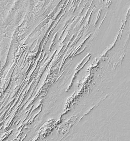
A benefit, at least one that I tell myself, of teaching mapmaking and graphic design to myself from scratch is the ability and willingness to find creative solutions for stumbling blocks. Eventually I found ways to tinker with the elevation data from the USGS and the design tools of graphic software to blend multiple layers including both traditional hillshade (with the sun at the upper left the way map readers are accustomed) and partially transparent layers with the sun at multiple angles or with exaggerated slopes, depending on the need of each map. My latest technique, unfortunately not yet reflected in any of the finished products I have completed, reintroduces the hypsometric tints I assumed I had abandoned back into the mix to show elevation as well as shade.
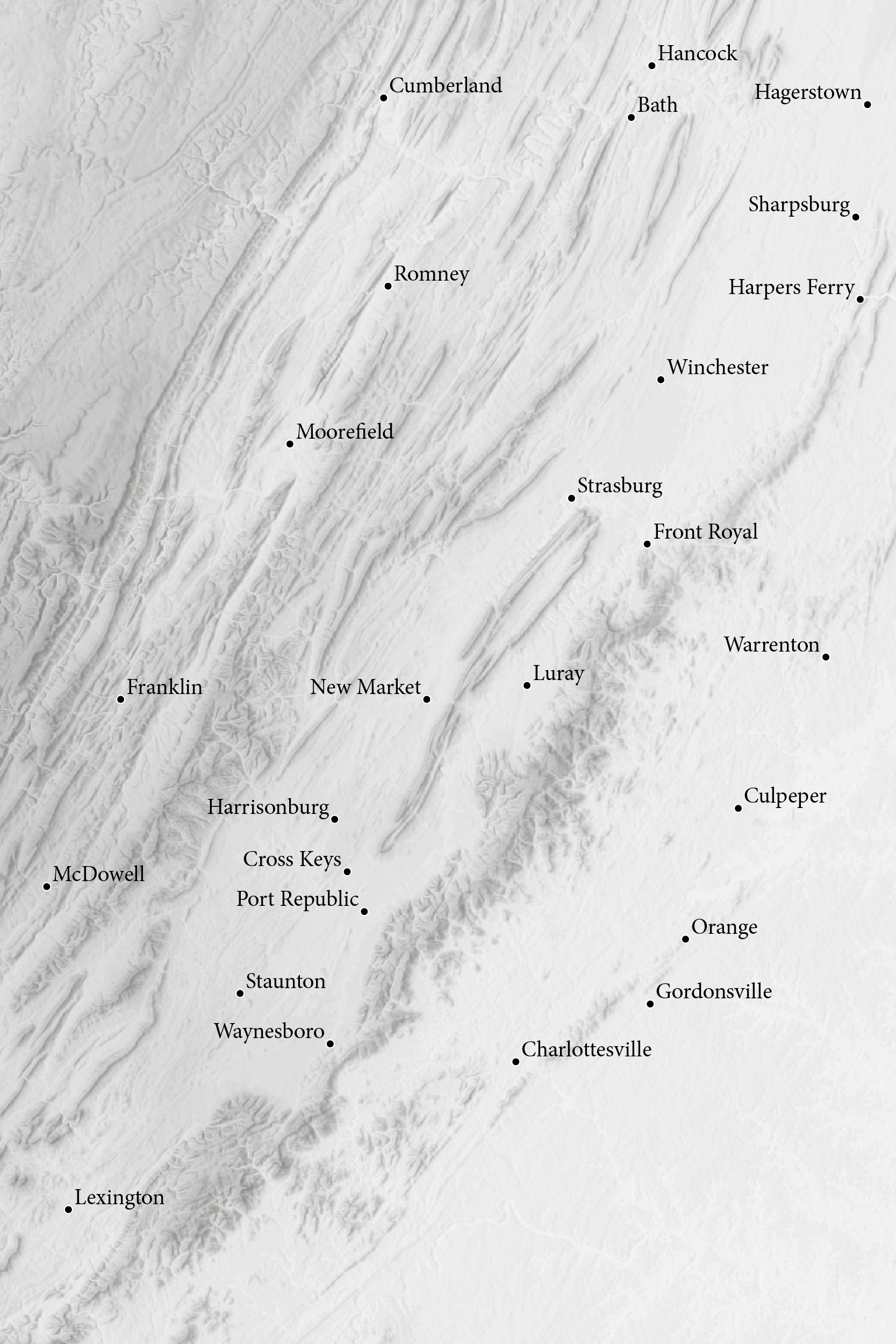
In addition to highlighting the Blue Ridge to the east and the Ridge & Valley Mountains to the west, the revised map of the Shenandoah Valley also demonstrates the consistent higher elevation of the Appalachians at the northwest corner of the map, a point I struggled to depict before seeing the value once more in hypsometric tints. A careful eye might even notice the rise in elevation as you proceed up the Valley, that is in a southwest direction from Harpers Ferry toward Lexington.
Ultimately, the shaded relief base now created (with a couple dozen reference points) is just a starting point for making a map. Everything else, be it water, labels, or troops, now must be digitally typed, dragged, and hand-drawn to customize the map for whatever purpose it will serve to show Civil War events in the valley of Virginia.
I love maps not only to explain terrain and troop movement, but also as beautiful documents in themselves. Thank you for explaining your map making process.
It would be nice to have more digital mapping available alongside published paper maps. IIRC UVa had a project of this for the valley years ago. An obstacle back then was the need for user to have installed GIS software to view the data. But today with online tools a browser is sufficient on the client side.