Let Us Know Which “Engaging” Cover Mock-Up You Like Best
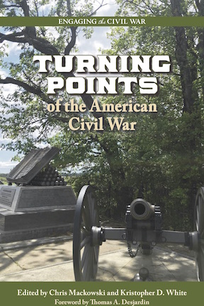
![]() We’re getting excited about the fall release of the first book in our “Engaging the Civil War” Series, a publishing collaboration with Southern Illinois University Press. The first book in the series is an essay collection edited by ECW co-founders Chris Mackowski and Kristopher D. White titled Turning Points of the American Civil War.
We’re getting excited about the fall release of the first book in our “Engaging the Civil War” Series, a publishing collaboration with Southern Illinois University Press. The first book in the series is an essay collection edited by ECW co-founders Chris Mackowski and Kristopher D. White titled Turning Points of the American Civil War.
We’ll offer more details soon, but in the meantime, here are a pair of cover mock-ups to whet your appetite. Which of the mock-ups do you like more?

I like the second cover.
The one on the right looks much better to me. Why feature the Engaging the Civil War at the top of the page, as in the image on the left? Better placed on the bottom as in the image on the right, since this is not the title of the book. Cheers,….. George
I vote for the version on right. You can then use that “Engaging the Civil War” logo at bottom of cover and keep the black color–this way you can vary the colors of the author/editor band at bottom of cover. I’m one of the marketing directors at a large performing organization and we wrestle with these issues frequently. Perhaps more to point, when will the series launch?
DITTO
Definitely #1. The banner at the top outlines the title better. The layout in #1 also subtly highlights the Civil War series and brings that concept to the mind of the reader. Should help to create interest in other books of the series. And the banner at the bottom of #2 is way too wide and the Engaging the Civil War is actually lost in this banner. People are top to bottom readers. Let them know right off that this is part of a series and they will go look for more. Page #2 setup says “Oh by the way, this is part of a series.” Too many readers won’t see that line at all.
I am in agreement with all the above
I like the first option with Engaging… across the top
I like the second too. Very nice.
– Michael Aubrecht
I like the one on the right as well.
The one on the right. Are you sure you presented the one on the left correctly? Don’t you want the green banner at the top of the cover, sliding it all up so there is a green border at the bottom? If not wording at the bottom is way too close to the edge. You should reconfigure A/left and try again.
That said, the one on the right will still probably be better, but there will be a real alternative. At present, A is not even a viable candidate.
I prefer the cover on the left. Too much of a green block at the bottom of the cover on the right.
The one on the right
My vote is for the one on the left. Much more symmetrical to my eye.
Version on the right.
The one on the right.
LIKE THE FIRST ONE ON THE LEFT . MORE OPEN ,BETTER EYE APPEAL
I wouldn’t use either as the final design. Of these two, I prefer the one on the right because it has better balance among the various elements. But on either design, the series title is left unexplained (on the left, it looks like part of the title; on the right, it looks like one element too many). Does it need to be on the front cover? Often series titles are somewhere in the front matter or on the back cover. I also wouldn’t break up the phrase “American Civil War” across two lines.
Well said.
I prefer the one on the left. It seems more balanced.
I like the first. I think it is better framed.
There is not that much difference between the two, I do like the narrower green banner at the bottom, but why have a green area at all? They both have the same photo, cropped the same way; it would be better with the photo cropped less, so you could see more of the monument and more of the cannon IMHO. It seems crowded.